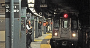
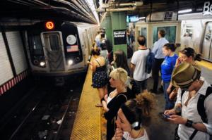
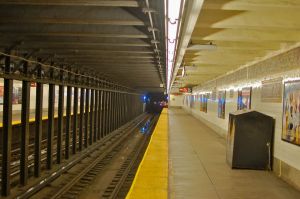
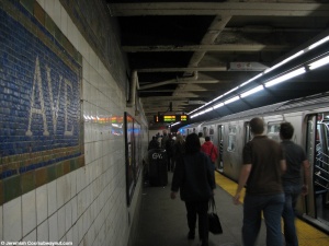
We had some scheduling problems, so our group didn’t get a chance to get out to test our concept in the subway system. That said, we spent some time analyzing content and developing a schema for culling images from social media that represent the neighborhoods of these stations. We also researched and agreed on the logistics of displaying imagery we don’t have ownership over.
Our IxD prototype is set to run throughout Monday and Tuesday, and we will be updating this entry on Wednesday with the results and our analysis. We’ve set up some content that we feel reflects the “feeling” of the studio and we’re testing engagement and participation by asking
What does IxD look like to you?
Lastly, we developed an outline for the proposal for Control Group, to implement an intervention on one of their kiosks. That outline can be found here, and we’ll be updating it throughout the week.
The high-level goals we’re hoping to achieve through testing over the next 2-3 weeks are:
- Understand if the content we’ve chosen to represent the neighborhoods is engaging and honest
- Determine the best areas of the subway platform, including the bottlenecks and the areas that can be seen from the car
- Determine if riders on the platform engaging with this content, such as stopping to look at it, interacting with the kiosk, etc.
- Determine the length of time each piece of content is displayed
The areas we’re focusing on are the subway platforms of the L train at Bedford Avenue, 1st Avenue, 3rd Avenue, and Union Square. We’ve chosen these areas because they are a continuous sequence of stations that traverse very different neighborhoods.
There is one commuting hub, Union Square, that many people, tourists and commuters alike, have experience with.
One station, Bedford Avenue, is a well-known destination and residential neighborhood.
The other two stations, 1st Avenue and 3rd Avenue, are not as well known, and serve as a pass through for many commuters coming from trendy areas along the L in Brooklyn.
These stops will help us test whether content is compelling enough to inform riders of areas they might otherwise not notice.


How did your Mon-Tue IXD setup go? Any good feedback?
I would like to send over your proposal to CG asap so that if it is a possibility you can start working on getting it going quickly.
I would also ask you to brainstorm ways of making your design more of a collaborative composition. With the CG kiosks being touch enabled there are a number of possibilities for people to engage at the location. People can also engage in other ways as well.
-Michael