Monthly Archives: November 2014

Team Flux – Week 4

Story:

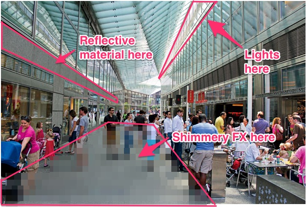
The space at North End Way is much quieter and darker at night. There is an eerie feeling to walking through the long, quiet corridor. As you walk through the 11,000 square feet passageway, passing all of the closed shops and restaurants there is a opportunity to provide a source of playfulness and intrigue.

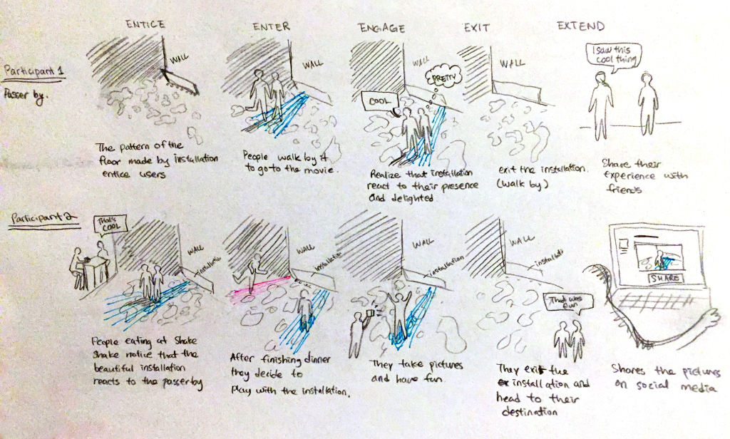
We will create a physical device that utilizes sheets of mylar, light and proximity sensors to produce light that will cause different and unique effects. The device will be places on the wall facing Shake Shack, near the entrance. Regardless of whether anyone is nearby, we will use the wind and light, reflecting off the mylar, to project light onto the ground. This light projection will be the first source of intrigue. As you get closer to the device the lights will brighten and will follow you as you walk around the space and near the device.


UX Diagram:

ux_journey

Leave a Comment

Filed under Final project – week 4

Team MALM’s UX Diagrams

Last week’s class on gaming was very useful for our team. We were so excited about the idea we came up with in class that we’d like to focus our next prototype on trying it out!

Here is a writeup about our game concept: Feed the Frog. The concept still manages to fulfill our 2 main goals, which were to bring people together in the park in a new way, and to make people feel like kids again through a nostalgic game.

Here are the UX diagrams we completed this weekend:

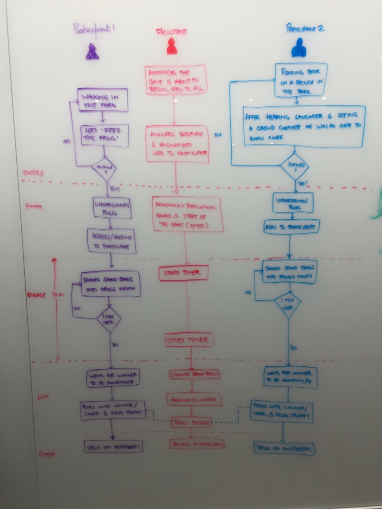
Flowchart

This flowchart demonstrates how 2 users move through the game over time, while a third “facilitator” plays a role in organizing and officiating the competition.

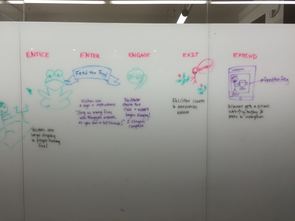
5 Es

This little storyboard demonstrates key interactions throughout a user journey.


Leave a Comment

Filed under Final project – week 4

Week 10 News

Class recap

Pete Vigeant gave a fun lecture about game design and each group participated in an exercise involving creating a game concept for the public space in which they’re working.

Assignment

Please create user experience diagrams for the next iteration of the prototype you’re planning to do. The diagrams should take two different users and walk through the experience. They should indicate the passage of time and any other characteristics of the environment that change and affect the experience. If there are multiple users involved, it should indicate their interaction. Please post your diagrams no later than Sunday, and add them to the Final project – week 4 category.

In addition, Aastha, Matt & Sarah will be presenting their tech presentations on Monday.

Leave a Comment

Filed under Final project – week 3, News

Team MALM Week 3

Original goals:

  • Make people feel like kids again
  • Bring people together

Goals for testing:

  • Encourage people to be creative.
  • Make people feel like they’re part of something bigger.

Questions:

  • Will collaborative storytelling facilitate interactions?
  • Will people be imaginative and unafraid to introduce wacky stories?
  • Do strangers strike up conversations based on this intervention?


photo-3


Analysis:

First we decided to experiment with another way to get at our goal: collaborative storytelling through a public interface. This was delightful, but didn’t gain traction as quickly as we would have liked. We ultimately decided to focus on another iteration of the tin cans for our field experiment this week.

CvISqIp4XeCQgIH4PPQP9M1qAfT8mUGNchoNveiGhlE,e-4jgnY3Xht44ypELdvDfO9gIiad1c-RMDv82Wx0rIs


Analysis:


The time, weather and location of the park installation matters. We had set ours up early on a cold Saturday morning, so while there was some foot traffic, there wasn’t a big crowd.

U1YpcP6jQJWGhC3TN-ogKnyNrenLyFifVvuXa2WeW5E,GoyVBuj4RkzV5W5e7LnHN_Ykj4CSSeoC2-6VbuytMis

The setup of our tin cans succeeded in capturing the attention of people passing by, who stopped to read the sign or take pictures. While several people were entertained and took photos of the setup, a handful of about 6-7 people actually tried to engage with it in the cold morning weather.

nX4HApUqBrts4sRnToAxI6NBu-CZWIBsy1k51K1r014

At the time we were there, most of the park goers were either alone or with their dog.  This made it difficult for them to try out the cans, which requires interaction between two people.

However, those who saw others interacting with the installation and were curious enough, would walk over and ask to join in.  Again, there was some disbelief and surprise when they realized a tin can telephone could work.

1 Comment

Filed under Final project – week 3

Team Flux – Week 3

Reiteration of our goals:

Encourage contemplation of nature in an indoor/outdoor urban space by amplifying the presence of nature in the space. Bring more personality to the space via elements of intrigue and interaction. Transform the space to be more welcoming at night.

Our experiment this week:

Our next steps last week were to understand how the effects might work in the space itself and identify the environmental factors (natural light and wind) that will affect the product at night.
We went to North End Way with a medium size sheet of Mylar (approx 6′ x 3′) and a flash light (500 lumens). We learned that there are multiple locations that light can reflect to cause different unique effects; it can reflect off the brick walls on both sides of the building and on the glass windows behind the seats when the shades are pulled down. It can reflect on the walls as well as the floor. The light that is in the space isn’t too overpowering and allows our light source to reflect a large amount of area. The more material we have and the brighter the lights the more space we can cover.

The space is much quieter and darker at night. It’s actually somewhat eerie to walk through the long, quiet corridor. As such, we believe there’s an opportunity to make it more attractive and interactive. Through our experiments we also found that the shimmering light enhances the surroundings by playing with the wind and provide a source of intrigue. Since evening hours are less busy, people have more time to stop and interact with the installation.

Passers-by certainly seemed intrigued, and we’ve had no trouble with security yet!

Using the space:

We’re focusing on two options, one at each end of the passageway.

Seating_Wall Shake_Shack_Wall

Next:
For our next ideation we can discuss through our findings at the space how we want to play with interactions with light. We can test this by setting up a structure in the studio that uses multiple IR sensors connected to multiple lights and as people walk through the studio and pass our space the light that reflects off the material will change. Our device will also be placed near a window to use the wind for naturalistic light effects.
We can test this with both the old material and the new more reflective material. Does being more reflective and more mirror like cause people to want to come up to the device? The higher order thing here is to play with switching between the regular / predicable and the irregular / unpredictable? That could be the mirror concept, or having motion affect the light source – which seems to be the stronger and likely more effective idea at this point. But how we achieve it is unknown – do we want a strip of LEDs, or a moving light, or a stationary light that rotates?

1 Comment

Filed under Final project – week 3

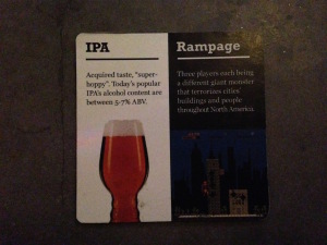
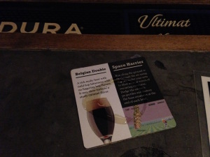
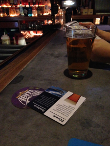
Team Tapper—Final Project—Week 3

IMG_5790

IMG_5787

Series of Goals:

  • Find out what draws people to play games
  • Connect the two worlds of game playing and beer drinking
  • Learn where the games are—wayfinding—awareness of what games are at each location
  • Make the bar more interactive

Take away from the test 2:

  • Bartender gives the coaster first before they serve the beer, so it is hard to match the beer and game through bartender
  • Content on our coaster is too long to read
  • Suggestion from the bartender: make it short and interesting to attract people
  • Suggestion from the bartender: the layout matters, we should try other locations as well, such as St.Marks and Williamsburg
  • Bartender says people play games because there is a connection to their childhood
  • The location and the layout matter, for example, NYU students go to the one in St. Marks often as a group, they enjoy playing game as a group, and some barcade locations are adding more group playing games, fighting games
  • Highlight that ALL of the games are 25 cents
  • Coaster need to have a nice design and brighter color to be noticed

New ideas:

  • Die-cut a quarter holder in all the coasters, so when someone orders a beer they have an incentive to test out an arcade game. We would have instructions on the coaster for a particular game and where it is located in the bar.
  • Breeding competition with groups of friends

1 Comment

Filed under Final project – week 3

Team Jared–What does IxD look like to you?

We had some scheduling problems, so our group didn’t get a chance to get out to test our concept in the subway system. That said, we spent some time analyzing content and developing a schema for culling images from social media that represent the neighborhoods of these stations. We also researched and agreed on the logistics of displaying imagery we don’t have ownership over.

Continue reading

1 Comment

Filed under Final project – week 3

TEAM NDHS (Parktalk) Week 3

Original Goals:

  • To create an experience that makes park-goers feel amusement and delight.
  • To create a mixing of regulars, tourists, and those who are wandering through the park, with possibly a focus on those who are just crossing through
  • To invite park visitors/people passing by to feel a sense of belonging

Additional Goals:

  • To encourage people to express themselves freely
  • To engage park visitors to feel ownership for their favorite spot
  • To CrowdSource map of the park  (similar to an analog Foursquare)

Original Parameters:

  • We will not cause annoyances to park goers
  • We will not obstruct anyone’s general path
  • In labeling and identification, we will not stereotype any region of the park
  • We will not create noise that overpowers the general ambiance of the park’s various pockets


  1. Take a photo or plan of the location that you are working in and highlight the spaces that you are activating.

 2nd Prototype Installation at SVA IxD floor:

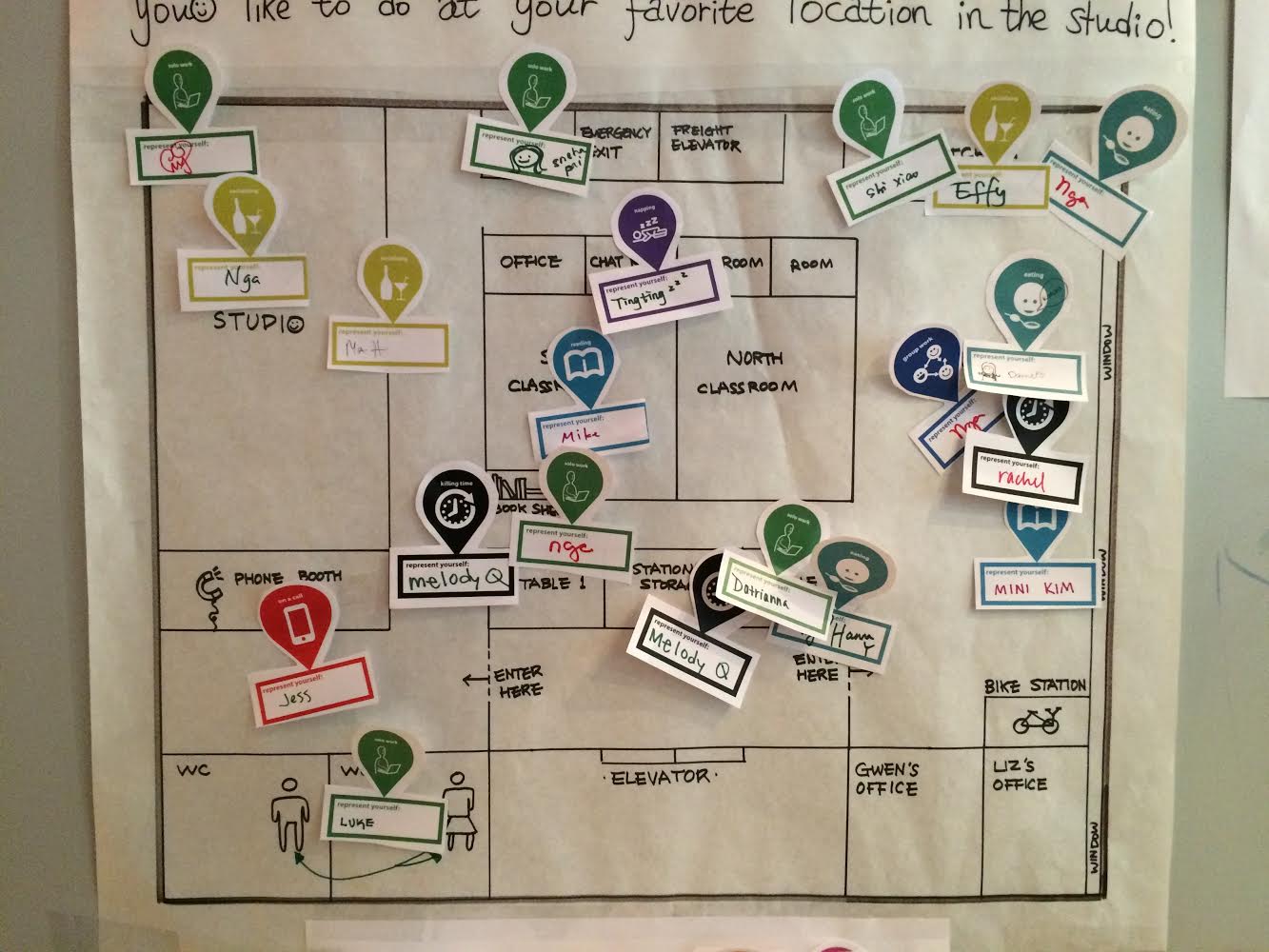
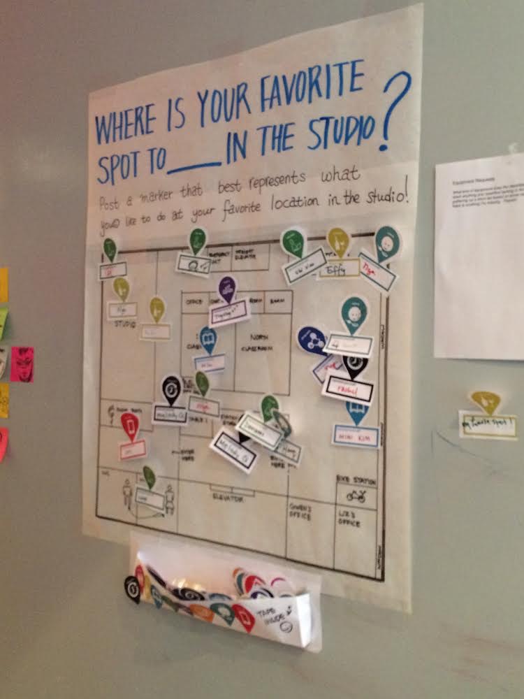
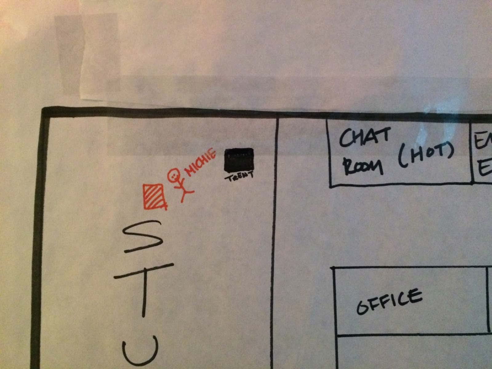
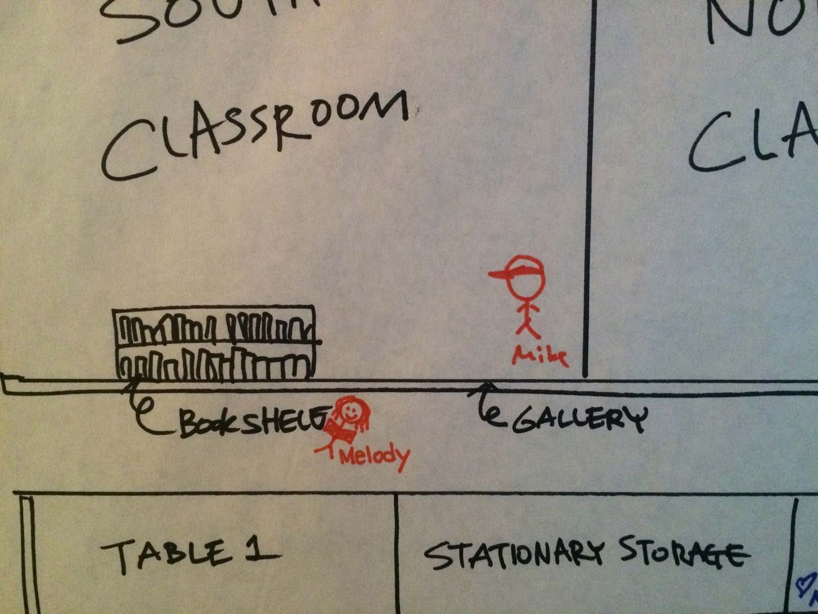
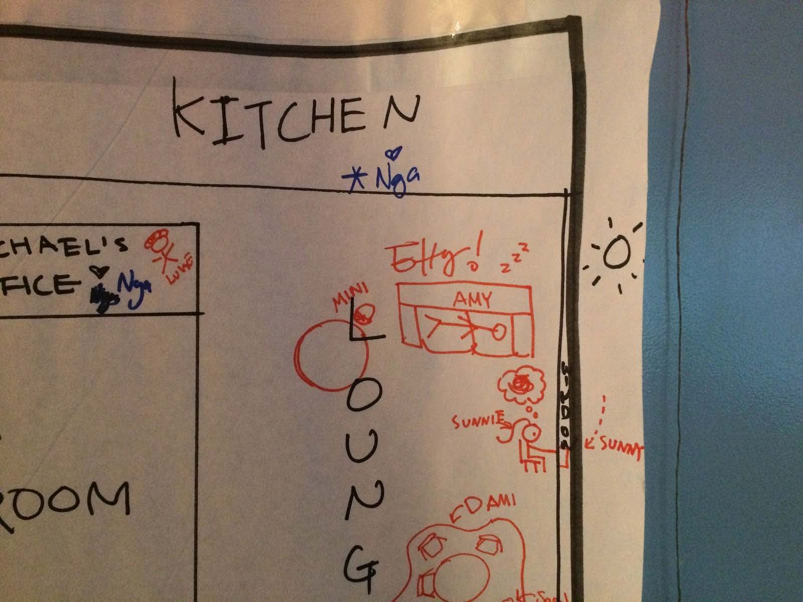
Prompt, Floor plan, and Activity icons (Killing time, Restroom, Socializing, Reading, Solo work, Napping, Class, Eating, On a call)


  1. First set up your second iteration at SVA IXD floor let it run for at least 24 hours, ideally 48.

We Installed on Monday, November 3rd, 2014 till Sunday, November 9th. (6 days)

unnamed-13 unnamed-12


2. Set it up at the actual location and document

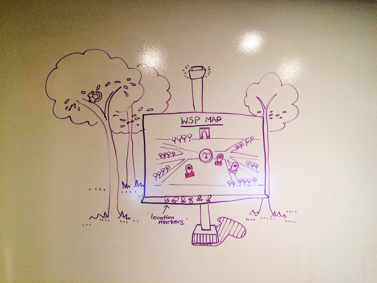
A 64 x 48 in foamcore setup of the Washington Square Park Map (Map is draw on a separate sheet) We’ll have thumbtacks and markers (some with iconography, some blank) to accomodate various levels of engagement and participation. We will keep it unattended, with a prompt that allows the user to read and participate on their own volition. We will keep the map at 3 different locations for 15-20 minutes each.

Processed with VSCOcam with c1 preset


3.Write an analysis of your findings

  • 21 location markers
  • 6 Solo work
  • 4 Socializing (3 at SVA IXD, 1 at outside of IXD)
  • 3 Killing time
  • 3 Eating
  • 2 Reading
  • 1 Group work
  • 1 Sleeping
  • 1 On a call


  • Women were more participatory than men
  • There might be a need for a reward for more active participation – or a sense of achievement. We will explore this further when we convert our analog prototype into a digital vision.
  • We may need a better way to encourage people to express themselves in a creative way. The previous iteration, when people drew directly on the paper in a “freestyle” mode, they were more graphically expressive, drawing caricatures of themselves, etc. In our current prototype, because we created iconography of various activities, people were more likely to write their name rather than draw anything in the “represent yourself” box. It also resembled a name tag (as a rectangle form).
  • We have to consider what happens when a popular area gets overlapped – How will everyone be visible when we have a higher density (high traffic)? Clusters? Number counts? Data viz?
  • Frequency and change over time (in a day, in a week, in an hour, in a certain season?)
  • We will also incorporate this map into a wayfinding digital vision (where live data and sensors could possibly impact and change a park-goer’s direction by suggestions)
  • We yet don’t know how color plays a role.


1 Comment

Filed under Final project – week 3

Week 9 News

Class recap:

  • Michael announced that next week he’ll be away and we’ll have a guest lecturer who specializes in creating public gaming experiences.
  • Mikey, Amy, Michie, Mini, Jeff and Hanna presented their tech reports.
  • Michael had individual meetings with each group to review project status and create plans for completing projects.

Assignment:

This week you will do your second iteration based on what we talked about in class.

  1. Write a series of goals that you want to understand through your testing. Go back to your original goals and parameters to make sure that they are aligned.
  2. Take a photo or plan of the location that you are working in and highlight the spaces that you are activating.
  3. First set up your second iteration at SVA IXD floor let it run for at least 24 hours, ideally 48.
  4. Set it up at the actual location and document
  5. Write an analysis of your findings

Please post documentation no later than Sunday, 11/9 and file it under the Final project – week 3 category.

Sam W., Sneha, and Sunnie are scheduled to present their tech research reports next week as well.


Leave a Comment

Filed under News

Team NDHS (nga,dami,hanna,sneha)


124 5 3

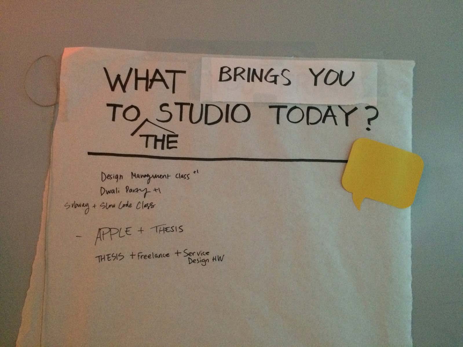
Prototype 1: PARK TALK: Given the result/finding from the Park Talk prototype we found that different users shared similar responses for their reasons in visiting the WSP.

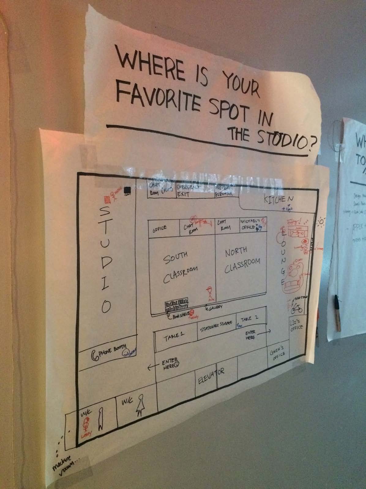
VISUAL STAMP: Building on from the first prototype we created a similar concept adding a visual map. Provocation “Where is your favorite spot in the Studio?” with a request for the participant to directly mark on the map. We found people liked to identify their favorite spot with a personalized icon/name . . . “personalized icon” of sort.

Define your user (towards final project)

*Primary User: Park goers: Families, Couples, Students, Dog walkers, Tourists, Local Neighbors

Write a creation myth:

There was a porcupine named Pip. He traveled a lot through the neighborhood in the woods, and he was always busy working. He worked by day, and he worked by night, gathering seeds and selling them at the porcupine farmers market. He never mingled with the other porcupines. One day Pip came across a clearing in the woods, which looked really relaxing and inviting. In the center of the clearing, he set down the pile of seeds and basked in the rays of the sunlight. He spent many hours pondering the existence of life and his life so far and when he was finally ready to leave – lo and behold: the seeds had sprouted into plants. He decided that he would walk to this clearing more often to clear his mind, and this would in turn help him continue to be productive.

Define your intervention: as thing, base sense, content delivery (in other words, think of it as an object, something that makes light sound or you touch, and think about how it communicates information)

*Combining our finding/insights from Park Talk + Visual Stamp prototype we created a communication tool that prompts park goers to share their personal POV of specific spots in WSP that is meaningful to them and share that w/others as a visual stamp on the WSP map.

Propose two new interventions Diverge based on your findings and propose two new interventions:

Proposal of 3rd prototype :

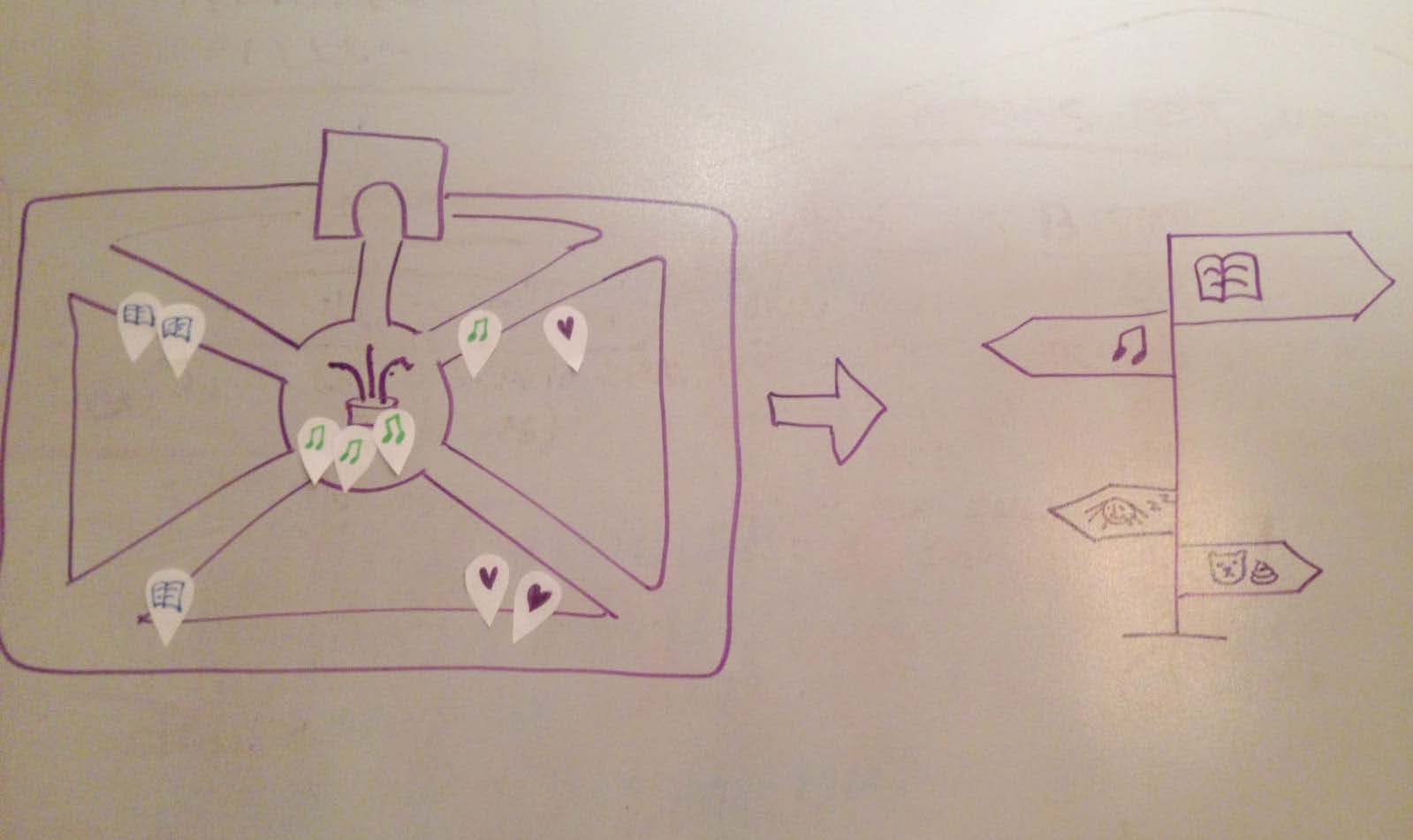
We learned from our first prototype why different people came to the park. We can categorize their activities and preferences. For our next prototype we would like to provide visual map of WSP, in addition provide the participants with a loosely created icon inviting park goers to create/place the different park activities such as: music, quiet spot/reading, meeting spot, romantic spot, spectating, dog walking, playground/family time on the map. Simultaneously, as people are participating/placing the icons on the maps we will be updating the way finding for other park goers where each of the activities are happening live with the icons contributed by other park goers. We see the prototype as a living thing created/used by the parkgoers. Note benefits: we are considering that the icons are personalized by the park goers themselves
6

Proposal of 4th prototype: Direct Engagement

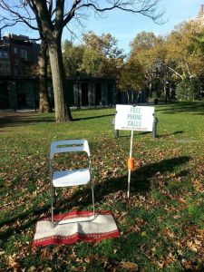
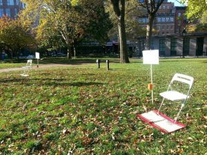
Setup of two chairs inviting two people to sit and to look deeply into the other person’s face for 15 seconds. Immediately, each participant is asked to write and/or draw one thing about the other person and write/draw what they feel from the experience. The result will be photographed and instagramed as part of a larger installation.

Goal of the prototype: With digital age we are losing the art of direct engagement.

Start thinking about your 6-week development plan

Leave a Comment

Filed under Uncategorized