 “Park Talk” Final Project Iteration #4
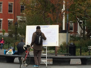
The simplicity of Park Talk installation incurred a significant amount of curiosities from a wide age range of passer byes in Washington Square Park.
Environment:
Date of launch: Sunday November 16th
Time of launch: 2:47 pm
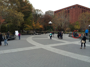
Location within WSP: North West side between Arch and Fountain
Weather: 46 degrees, Cloudy, light brisk wind with late intermittent drizzle at the last 5 minutes
Duration: 30 minutes
Set-up
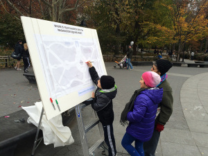
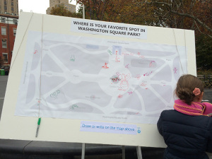
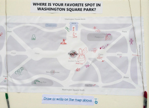
Our set up included the map of WSP mounted on a 60”x40” Board with a prompt asking: “Where is your favorite spot in Washington Square Park”? We provided colored sharpies attached to the board for users to sketch or write their response directly on the map.
Observation
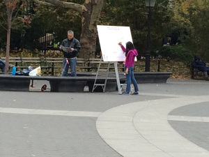
For our fourth iteration of the prototype we sat 20 yards distance from the set-up of our prototype and unobtrusively observe the type of users, level of user engagement/interaction in relationship to the Park Talk installation and people nearby. To our surprise we learned that our installation captured interest from both kids and adults with slightly different end result in the manner in which the engagement produces for each group of users.

User 1: Kids
Adult/Family with kids ranging from 2 to 13 years of age
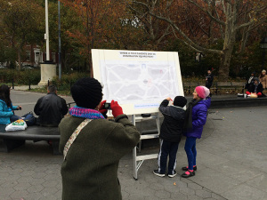
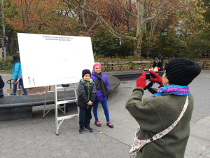
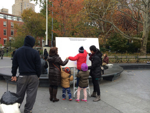
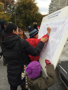
Kids showed curiosity and excitement when they saw the board. Anticipating the response from; either their grandmother, parent(s) or guardian’s permission to have closer look to draw on the board. In one case it was a whole family event. Parents took delight that the kids got excited in the participation that they even took photos of their kids.
Grandmother with her grandkids (est. 6 to 9 yrs age)


Family with kids (Father, Mother, Grandmother, 3 kids- est. 4 to 7 years of age)


Couple with toddler

Pre-teen girls (est. 9 to 13 years of age)


User 2:
Adults, M/F– Couples and Single participants (18 to 50+)
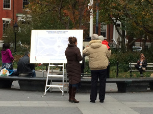
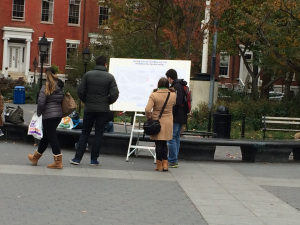
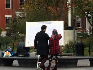
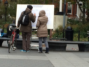
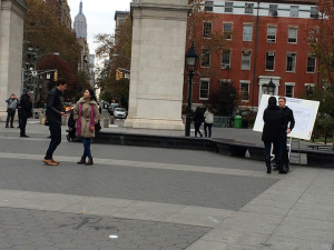
We had equal level of engagements between people who were by themselves and traveling with companions taking interest to stop and look at the prototype installation. Some couples and individuals were very quick to contribute, some would pass and/or linger before seeing other engaged users before they themselves participated in drawing/writing onto the board.
One particular finding of interest was that solo participants were engaging with one another over the Park Talk installation. While we were too far of a distance to understand what they were saying we watched their body language and interaction and can only guess that they were sharing something related to either the WSP, map/prototype installation or what they were drawing. . . this particular piece of installation brought two strangers to engage in a conversation!
Couples


Solo guy + Solo girl joins


Strangers meeting strangers

Findings
Given the dreary weather and how quiet the WSP was than our previous visits we were surprised and delighted at the high level of participation from kids and adults with the Park Talk prototype installation. This prototype iteration while slightly modified and having it left unattended resulted in higher kids engagement than the first prototype launched back in late september. Also, people had natural curiosities to stop, look/read the prototype installation incurring additional interests from passer byes to participate. With a traction of one or two user again created more interests; pulling people from a distance to stop and look at the board. While they may not directly draw or sketch we observed people either made exchange with other users or with their travel partners.
*For family with kids– the discovery of the Park Talk installation along their path offered serendipity and delight for the kids to engage free-form with the larger audience.
*For adults: WSP public space, intervened by this installation enabled a sharing which allowed a conversation/engagement by two random people. In conclusion, we felt that our Park Talk prototype installation was a success drawing curiosity, delight and enabling natural/genuine conversations.
As a group we were delighted our Park Talk prototype brought smile and playfulness to the public space in Washington Square Park in such a cold and dreary day.
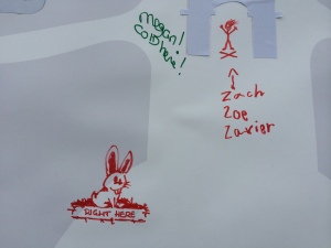
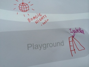
Final Park Talk Board Contributed by Washington Square Park Visitors

Close-ups of some of the drawings
